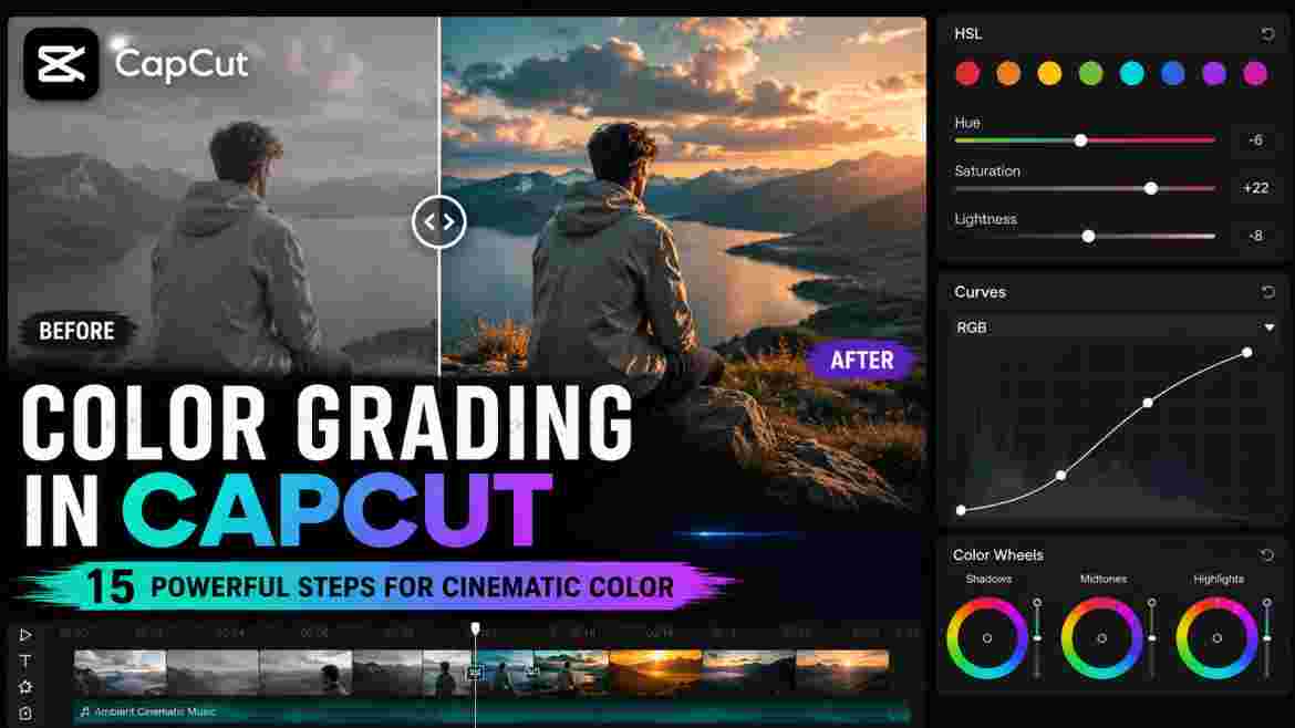
A polished video is not created by transitions, effects, captions, or sharp footage alone. Color has an enormous influence on whether an edit feels consistent, intentional, and professionally finished. A beautifully composed clip can still look amateur when skin appears orange, highlights are harsh, shadows lose detail, or one shot suddenly looks much warmer than the next. Learning Color Grading in CapCut gives creators a practical way to solve these problems while developing a visual style that fits the story they want to tell.
The challenge is that many beginners approach color backward. They search for a “cinematic preset,” copy another creator’s contrast and saturation values, apply a LUT, and expect the footage to immediately resemble a professionally graded film. Sometimes the result looks acceptable. Often it becomes too dark, too saturated, unnaturally warm, or inconsistent from clip to clip.
The problem is not necessarily CapCut or the preset. Every recording begins from a different visual starting point. Footage recorded outdoors at noon behaves differently from a clip captured beside a window on a cloudy morning. Smartphone footage may already contain substantial contrast and saturation, while footage from another camera may appear comparatively restrained. Artificial lighting can introduce yellow or green casts, and different cameras can render the same skin tone differently.
That is why Color Grading in CapCut should not begin with fixed numerical settings. It should begin by understanding the footage. You first identify technical problems, correct them, establish consistency between related clips, and then create the desired visual character.
The guiding principle throughout this article is simple:
Correct the footage first. Create the look second.
Following that principle makes Color Grading in CapCut far more predictable. Instead of using one adjustment to compensate for another, you build the image in a logical order. Exposure becomes the foundation, white balance establishes believable color, contrast creates tonal structure, selective adjustments refine individual colors, and creative grading determines the final mood.
This complete guide explains that workflow from beginning to end. You will learn how exposure, highlights, shadows, temperature, tint, saturation, HSL, Curves, Color Wheels, LUTs, filters, and shot matching fit together. You will also learn how to protect skin tones, approach cinematic color, grade different types of videos, troubleshoot common problems, and recognize when you have pushed an adjustment too far.
CapCut changes over time, and the exact interface or availability of particular controls can differ across desktop, mobile, web, software versions, regions, and account configurations. For that reason, this guide concentrates on durable color-grading principles rather than assuming that every reader sees precisely the same buttons in the same location.
Whether you edit YouTube videos, TikToks, Instagram Reels, travel montages, talking-head videos, product demonstrations, food videos, vlogs, or creative short films, the fundamental objective of Color Grading in CapCut remains the same: make every color decision support the footage instead of distracting from it.
What Is Color Grading in CapCut?
Color grading is the deliberate process of changing the tonal and color characteristics of video footage to achieve a particular visual result. That result may be natural and almost invisible, or it may be deliberately stylized. What matters is that the changes are intentional.
When performing Color Grading in CapCut, you may adjust overall brightness, contrast, highlights, shadows, temperature, tint, saturation, or individual colors. More detailed workflows can also involve HSL, Curves, Color Wheels, LUTs, filters, and automated or matching tools available in the version of CapCut you use.
The purpose is not simply to make colors stronger. A successful grade can make a scene warmer, colder, softer, more dramatic, cleaner, more subdued, more energetic, or more cohesive. It can also help footage recorded with different cameras or under different lighting conditions feel as though it belongs in the same video.
That makes color part of storytelling.
A warm treatment may reinforce the comfort of an indoor lifestyle scene. Cooler tones may complement a rainy urban sequence. Controlled saturation can help a premium product video feel refined, while richer colors may support an energetic travel montage. None of these choices is automatically correct. The visual treatment should follow the purpose of the footage.
Color Correction vs. Color Grading
Color correction and color grading are closely related, but understanding the difference gives Color Grading in CapCut a much clearer structure.
Color correction primarily deals with technical or visual problems already present in the footage. A clip may be too dark, too bright, excessively warm, unusually green, washed out, or noticeably different from neighboring shots. Correction attempts to create a balanced and usable starting point.
Color grading is primarily creative. Once the footage is reasonably corrected, you decide how it should feel. You may introduce warmth, reduce particular background colors, create stronger tonal separation, apply an appropriate LUT, or develop a consistent visual identity across the entire video.
A useful distinction is:
Color correction asks, “Does this footage look right?”
Color grading asks, “How should this footage feel?”
These processes can overlap. You may discover a technical problem after beginning the creative treatment and return to correct it. That is normal. The important lesson is that creative styling should not become a substitute for basic correction.
Why Correction Should Usually Come First
Imagine an indoor clip in which a person’s face already looks too orange. You immediately add a warm filter because you want a cozy cinematic appearance. The filter makes the face even warmer. You reduce saturation to compensate, but now the background looks weak. You increase contrast, adjust HSL, and eventually have several controls fighting one another.
A better approach to Color Grading in CapCut would have been to correct the unwanted color cast first. Once the face and environment looked believable, you could introduce creative warmth while monitoring how it affected the subject.
Exposure works the same way. If a clip already contains very dark shadows, aggressive contrast may remove even more detail. If highlights are already extremely bright, a strong tonal curve can make them harsher.
Technical correction creates room for creative decisions.
Why There Is No Universal Color-Grading Formula
One of the most important things beginners can learn is that identical settings do not create identical results.
Suppose a tutorial recommends increasing temperature. That adjustment may improve footage that begins slightly cool. Apply the same value to footage that is already warm, and skin may become orange.
The same applies to contrast, saturation, highlights, Curves, and LUTs. Their effect depends on the information already present in the image.
For this reason, successful Color Grading in CapCut depends more on visual judgment than copied values. Settings can be useful examples, but they should never be treated as universal formulas.
Why Color Grading Matters for CapCut Videos
Color work can be subtle enough that viewers never consciously notice it, yet it can strongly influence how professional a finished video feels.
A viewer may not think, “Those two shots have mismatched white balance.” They simply sense that the edit looks inconsistent. Similarly, they may not understand why an oversaturated face looks wrong, but they recognize that the person no longer appears natural.
It Creates Visual Consistency
A video often combines footage recorded at different times or under different conditions. Morning footage may be cool, indoor clips may be warm, midday footage may contain hard highlights, and evening footage may be darker.
Good Color Grading in CapCut does not necessarily make all those environments identical. Instead, it removes unwanted inconsistencies while preserving intentional differences.
This becomes particularly important when footage comes from multiple cameras. A phone, action camera, drone, and dedicated camera may process contrast and color differently. Matching them can make the sequence feel like one coherent production rather than several unrelated sources.
It Supports the Mood of the Video
Color can influence emotional interpretation. Warmth may support comfort, sunlight, nostalgia, or energy. Cooler treatment may complement technology, nighttime, winter, calmness, or tension. Muted color can feel restrained, while richer color can create excitement.
These are creative possibilities rather than strict rules.
The strongest Color Grading in CapCut begins by asking what the scene needs emotionally before deciding what color treatment to apply.
It Helps Direct Attention
Brightness, contrast, and color influence where the eye looks.
Imagine a presenter standing against a highly saturated green background. If the environment competes with the face for attention, selectively reducing the green intensity may help the subject stand out.
The same principle can work for products. A product may need better tonal separation from its background rather than simply more global saturation.
Color grading can therefore support composition as well as aesthetics.
It Makes Simple Edits Feel More Finished
A straightforward talking-head video with clean exposure, natural skin, controlled contrast, and consistent color can look more professional than an edit overloaded with effects.
This is an important lesson for creators. Visual polish does not always require more elements. Sometimes it comes from making the existing footage more coherent.
Understanding the Main CapCut Color-Grading Controls
Before building a complete workflow, you need to understand what the major controls are intended to change.
The names, locations, and availability of these controls can vary, but the visual principles remain useful regardless of platform.
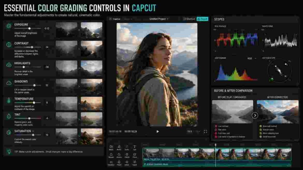
Exposure
Exposure affects the overall brightness of the image. If the entire clip appears too dark, increasing exposure may provide a better starting point. If the whole image is excessively bright, reducing it may help.
However, exposure is broad. If a person’s face looks correct but the sky is too bright, reducing the entire exposure could create a new problem by darkening the face.
A disciplined approach to Color Grading in CapCut uses exposure when the overall image needs correction and more targeted controls when the problem is limited to a specific tonal region.
Brightness
Brightness-related controls can appear similar to exposure, and their precise behavior depends on the editing implementation.
The practical lesson is to judge the result rather than relying on the control name. If an adjustment improves the intended area without damaging the rest of the image, it may be appropriate. If it fixes one problem while creating two others, consider a more targeted approach.
Contrast
Contrast determines how separated bright and dark regions appear.
Increasing contrast can create depth, definition, and visual punch. Reducing it can soften the image or create a flatter tonal character.
High contrast is frequently associated with cinematic footage, but excessive contrast can destroy useful information. Dark hair may become a featureless black shape, facial shadows can become harsh, and bright surfaces may lose texture.
Professional Color Grading in CapCut uses contrast to establish appropriate depth rather than maximizing the difference between light and dark.
Highlights
Highlights influence brighter portions of the image, such as skies, windows, white clothing, illuminated skin, lamps, and reflective objects.
Reducing highlights can sometimes produce a more controlled image, but it is important to understand what editing can and cannot recover.
If a bright region was completely clipped during recording and contains no useful detail, lowering highlights cannot magically reconstruct the missing information. It may make the region darker, but the original detail may still be absent.
Shadows
Shadows affect darker areas of the image.
Raising them can reveal detail in dark clothing, hair, interiors, and backgrounds. Lowering them can create deeper blacks and stronger tonal separation.
Both directions can be overused.
Excessive shadow recovery can reveal noise and flatten the image. Excessively dark shadows can hide important information.
The goal is not to make every region equally visible. A nighttime scene should still feel dark. Good Color Grading in CapCut preserves the atmosphere while keeping important visual information readable.
Temperature
Temperature controls the warm-to-cool character of the image.
Warmer adjustments generally move toward yellow and orange, while cooler adjustments move toward blue.
Temperature is especially important for correcting white balance. Footage recorded under warm indoor lighting may look excessively yellow, while shaded outdoor footage can appear unusually blue.
After correction, temperature can also be used creatively. A gentle warm treatment can support an inviting atmosphere, while a controlled cool shift may complement a nighttime scene.
The key is knowing whether you are correcting a problem or deliberately creating a mood.
Tint
Tint generally works along a green-to-magenta relationship.
A clip can have reasonable temperature while still containing an unwanted green cast. This is common under certain artificial lighting conditions.
If skin appears green, simply adding warmth may not solve the actual problem. A tint adjustment may be more appropriate.
Understanding that distinction makes Color Grading in CapCut more precise because you stop using one control to compensate for an unrelated issue.
Saturation
Saturation controls the intensity of color across the image.
Increasing it makes colors more vivid. Reducing it makes them more muted.
The difficulty is that global saturation affects everything simultaneously. If you increase saturation because the sky looks weak, you are also intensifying skin, grass, clothing, products, signs, and every other color.
This is why excessive saturation is one of the most common beginner mistakes.
Instead of asking how much saturation a video “should” have, determine whether the whole image actually needs stronger color.
HSL
HSL stands for Hue, Saturation, and Lightness. It allows more selective control over individual color ranges.
Hue changes the character of a selected color. Saturation controls its intensity. Lightness changes how bright or dark it appears.
HSL significantly expands what is possible with Color Grading in CapCut because it allows you to address one problematic color without making the same adjustment globally.
Suppose a travel clip contains natural skin, a balanced sky, and excessively vivid grass. Lowering global saturation would weaken everything. Selectively reducing the green range may solve the actual problem more cleanly.
Curves
Curves provide more targeted tonal control than a basic contrast slider.
A common technique is a subtle S-shaped curve that slightly darkens lower tones while gently lifting brighter tones. This can increase perceived depth.
But there is nothing automatically professional about an S-curve.
If the original footage already contains strong contrast, applying another aggressive curve can crush shadows and make highlights unpleasant.
Use Curves because the image needs more precise tonal shaping, not because advanced tutorials happen to show them.
Color Wheels
Color Wheels can allow different tonal regions to receive different color characteristics, depending on the controls available in your CapCut version.
This can help establish relationships between shadows, midtones, and highlights.
For example, a creator might introduce slightly cooler shadows while keeping brighter regions warmer. Used carefully, this can create depth and separation.
Used aggressively, it can create obviously blue shadows and orange skin.
Subtlety is particularly important when Color Wheels become part of Color Grading in CapCut.
LUTs
A LUT, or lookup table, applies a predefined transformation to color values.
LUTs can be useful for establishing a creative starting point or maintaining a particular look across compatible footage.
However, a LUT does not understand the condition of your source clip. It does not know that the face is already orange or the shadows are too dark.
That is why LUTs should not be treated as automatic correction.
Filters
Filters provide quick predefined styles. They can be practical for short-form content where speed is more important than detailed manual control.
The problem occurs when creators combine a strong filter with equally strong manual adjustments. If the filter already increases warmth, contrast, and saturation, pushing all three again can create an overprocessed image.
Understand what the filter contributes before adding more.
CapCut Color-Grading Tools Compared
The following table provides a practical reference for choosing the right tool during Color Grading in CapCut rather than moving sliders randomly.
| Tool | Primary Purpose | Useful When | Common Mistake |
|---|---|---|---|
| Exposure | Adjust overall brightness | The whole clip is generally too dark or bright | Using it when only one tonal region needs correction |
| Contrast | Control separation between light and dark | Footage looks flat or overly soft | Crushing shadows to imitate a cinematic look |
| Highlights | Refine brighter areas | Skies, windows, white objects, bright skin | Expecting completely clipped detail to return |
| Shadows | Refine darker areas | Hair, dark clothing, interiors, backgrounds | Lifting shadows until the image becomes noisy or flat |
| Temperature | Control warm/cool balance | White-balance correction and creative mood | Making skin excessively orange or blue |
| Tint | Control green/magenta balance | Correcting subtle artificial-light casts | Trying to solve a tint problem with temperature |
| Saturation | Control overall color intensity | The whole image needs more or less color | Oversaturating skin, vegetation, skies, and products |
| HSL | Refine selected colors | Skin, grass, skies, clothing, products | Making extreme selective changes |
| Curves | Shape tonal relationships | Basic contrast lacks enough precision | Applying an aggressive S-curve automatically |
| Color Wheels | Color different tonal regions | Creative shadow/highlight separation | Creating obvious teal-and-orange color |
| LUTs | Apply predefined transformations | Building a repeatable starting look | Treating the LUT as a one-click correction |
| Filters | Apply quick styling | Fast creator and social-media workflows | Stacking strong filters with heavy manual adjustments |
The table is not a checklist. You do not need to use every control on every clip.
Sometimes the most professional result comes from three small adjustments rather than ten large ones.
How to Do Color Grading in CapCut Step by Step
A reliable workflow prevents one adjustment from unnecessarily compensating for another. The following process moves from technical correction toward creative styling so that every decision has a logical purpose.

Step 1: Import and Organize the Footage
Start by importing your footage and creating a rough edit.
Remove obvious mistakes, unusable takes, and sections that will not appear in the final video before spending significant time on color.
This improves efficiency because you only grade footage that matters.
As you organize the timeline, notice which clips were recorded under similar conditions. Shots captured in the same room under the same lights may need similar correction, while outdoor footage recorded later may require a different treatment.
Organization may seem unrelated to Color Grading in CapCut, but it becomes extremely useful when matching large groups of clips.
Step 2: Watch the Sequence Before Making Adjustments
Do not begin by immediately moving sliders.
Watch the footage first.
Look for patterns rather than isolated imperfections. One camera may consistently appear cooler. Indoor clips may have a green cast. Outdoor footage may contain stronger contrast. One section may be noticeably darker than the rest.
Diagnosis should come before correction.
If you understand what is wrong, you can choose the control designed to address it. Without diagnosis, color work becomes trial and error.
Step 3: Choose a Reference Shot
Select a representative shot for each major scene.
A useful reference should have reasonably balanced exposure, representative lighting, enough visible tonal detail, and believable skin when people are present.
Correct that clip carefully and use it as a visual target for neighboring footage.
This is a crucial habit in Color Grading in CapCut because it prevents you from treating every clip as an independent image.
The viewer experiences a sequence. Your grade should reflect that.
Step 4: Correct Overall Exposure
Evaluate the reference clip’s overall brightness.
Can you comfortably see the subject? Is the entire image too dark? Is everything too bright?
Make conservative exposure changes.
Do not try to create dramatic mood yet. At this stage, you are establishing a technically usable baseline.
If only highlights are problematic, work with highlights. If only shadows need attention, use a more targeted adjustment. Avoid changing the whole image when the problem affects only one region.
Step 5: Correct White Balance
Next, examine temperature and tint.
Look for unwanted color casts rather than trying to make every scene perfectly neutral.
A sunset should still feel warm. Colored stage lighting should still contain color. A blue nighttime environment does not need to look like daylight.
White-balance correction is about removing unwanted bias while respecting the natural lighting.
This stage is especially important for Color Grading in CapCut when people are present because faces make color errors easier to notice.
If skin appears too yellow, blue, green, or magenta, check the overall balance before trying to repair the face selectively.
Step 6: Balance Highlights and Shadows
Once the overall exposure is usable, refine the brightest and darkest regions.
If a sky dominates the image, lowering highlights may create better balance. If dark clothing hides useful detail, raising shadows slightly may help.
Do not flatten the image by trying to make everything equally visible.
Brightness differences create depth.
The goal is to preserve meaningful information while maintaining the natural tonal hierarchy of the scene.
Step 7: Establish Appropriate Contrast
Now examine how light and dark areas relate.
If the image feels flat, controlled contrast may create more depth. If it already looks harsh, reducing contrast may produce a more pleasing result.
Check important details after every significant change.
Look at dark hair, black clothing, facial shadows, clouds, white objects, and bright surfaces.
A successful Color Grading in CapCut workflow should improve tonal separation without unnecessarily destroying information.
Step 8: Correct Overall Saturation
With exposure and contrast established, evaluate global color intensity.
If everything looks muted, a modest saturation increase may help. If the footage is already vivid, you may need no increase at all.
Pay particular attention to skin.
If faces become red or orange while the environment becomes attractive, global saturation is probably not the right solution.
This is where selective tools such as HSL become valuable.
Step 9: Refine Individual Colors With HSL
Identify colors that still need attention.
Perhaps green vegetation is too vivid, the sky is excessively bright, a red shirt dominates the frame, or skin has a subtle unwanted shift.
HSL allows more selective correction.
Make small changes and inspect the entire frame afterward because the same color range can appear in multiple objects.
An orange adjustment intended for skin may also influence wood, walls, clothing, food, or sunset colors.
Selective does not mean isolated.
Step 10: Shape the Tonal Range With Curves
If basic contrast does not provide enough control, Curves can refine the tonal structure.
You may want deeper lower-midtones without making the darkest regions completely black, or brighter upper-midtones without aggressively increasing the brightest highlights.
Small curve movements can produce significant changes.
During Color Grading in CapCut, Curves should solve a visible tonal need rather than serve as proof that you are using an advanced tool.
Step 11: Create the Creative Look
The footage should now look reasonably balanced even without a strong style.
That is the ideal moment to create the mood.
Ask what the video actually needs.
A clean educational tutorial may require very little creative treatment. A warm travel montage may support richer environmental color. A nighttime city sequence may work with cooler shadows and controlled highlights.
Use the tools available to create the visual direction, but keep the subject and story more important than the effect.
Step 12: Match Related Clips
Compare neighboring shots with your reference.
Start with major differences. Correct exposure before worrying about subtle hue differences. Correct white balance before trying to match a specific shade of blue.
Then refine contrast, saturation, and individual colors.
Matching is one of the most valuable aspects of Color Grading in CapCut because consistency often contributes more to perceived quality than an elaborate grade on one isolated shot.
Step 13: Review the Cuts During Playback
Do not judge everything from paused frames.
Play Clip A into Clip B.
A sudden change in brightness, temperature, saturation, or contrast becomes easier to notice at the cut.
If the viewer’s attention shifts from the story to the color difference, the clips may need additional matching.
Step 14: Compare With the Original
Your eyes adapt while editing.
After looking at a warm image for several minutes, that warmth may begin to feel neutral. The same can happen with strong saturation or deep contrast.
Compare the graded result with the original periodically.
This does not mean the final grade must remain close to the source. The comparison simply helps you recognize how far your decisions have moved the image.
Step 15: Export and Inspect the Final Video
Do not judge Color Grading in CapCut only from the editing preview.
Export the video and inspect the actual file.
Different screens, playback environments, brightness settings, compression, and platform processing can influence appearance.
For an important project, check the result on more than one suitable display when practical.
How to Use HSL for Color Grading in CapCut
HSL is one of the most useful tools for moving beyond broad corrections because it gives you greater control over specific color families.
The advantage is precision. The danger is overconfidence.
Just because you can transform a color dramatically does not mean you should.
Understanding Hue
Hue controls the character of the selected color.
Suppose green vegetation appears too yellow. A subtle hue shift may create a more pleasing green.
However, moving it aggressively can make natural foliage appear cyan or turquoise.
For realistic footage, refinement generally works better than replacement.
Understanding Selective Saturation
Selective saturation allows one color range to become stronger or weaker without applying the same change globally.
Imagine a person standing in front of vivid green vegetation. Their skin looks natural, but the background competes for attention.
Reducing green saturation slightly can calm the environment while preserving the subject.
This is an excellent example of how Color Grading in CapCut can support composition rather than simply beautifying colors.
Understanding Lightness
Lightness controls how bright or dark the selected color appears.
It is frequently overlooked because saturation seems like the obvious way to strengthen color.
Consider a pale blue sky. Instead of dramatically increasing blue saturation, slightly reducing blue lightness may create a deeper appearance while keeping the color believable.
Brightness and saturation influence how we perceive one another.
Refining Green Vegetation
Vegetation is easy to overprocess.
Many cameras and phones already render greenery strongly. Increasing global saturation can turn grass and leaves fluorescent.
If greens dominate the scene, first determine whether the problem is their hue, saturation, lightness, or a combination.
Small selective corrections usually preserve more realism.
Refining Blue Skies and Water
Blue skies and water are popular targets during Color Grading in CapCut because creators often want them to appear deeper.
Avoid assuming that stronger blue saturation is always the answer.
A small lightness change or subtle hue refinement can sometimes produce a richer result.
Also remember that blue adjustments may affect clothing, signs, reflections, and objects elsewhere in the frame.
Refining Skin-Related Colors
Skin requires greater care because relevant color ranges can overlap with red, orange, and yellow objects.
If skin looks too orange, check white balance and global saturation before immediately adjusting HSL.
Once the overall image is balanced, selective correction may help.
The objective is believable skin, not forcing every person’s complexion toward one standardized color.
How to Use Curves for Color Grading in CapCut
Curves become useful when basic tonal controls are too broad.
They allow more precise shaping of the relationship between darker, middle, and brighter tones.
Building Controlled Contrast
A gentle S-curve can create tonal separation by slightly lowering darker regions and lifting brighter regions.
The technique is common because it can work well, but it is not mandatory.
Evaluate the footage before adding it.
If the source already contains substantial contrast, another curve may make the image unnecessarily harsh.
Avoiding Crushed Blacks
Crushed blacks occur when dark regions lose meaningful detail.
Hair, clothing, furniture, nighttime backgrounds, and facial shadows can all be affected.
Some creative styles intentionally use deep blacks, but accidental information loss rarely improves the video.
Good Color Grading in CapCut distinguishes intentional darkness from uncontrolled clipping.
Protecting Bright Detail
Strong Curves can also damage brighter regions.
Watch facial highlights, white clothing, clouds, windows, and reflective products.
A curve that makes the overall image more dramatic may simultaneously make skin unpleasant.
Always judge the complete frame.
Knowing When Curves Are Unnecessary
Advanced tools should not become mandatory steps.
If exposure, highlights, shadows, and basic contrast already produce the tonal structure you want, adding Curves may provide no meaningful benefit.
Knowing when not to make an adjustment is part of good grading.
How to Use Color Wheels for Color Grading in CapCut
Color Wheels can help create relationships between tonal regions rather than tinting the entire image equally.
This can produce more sophisticated creative separation when the controls are available in your workflow.
For readers who want to explore this control further, the official CapCut Color Wheel guide explains how CapCut uses Color Wheels to refine different tonal and color relationships.
Working With Shadows
A slight color influence in the shadows can change the atmosphere without affecting highlights equally.
Cooler shadows may complement certain nighttime or dramatic scenes.
However, shadows contain important objects. Push the adjustment too far and hair, black clothing, furniture, and facial detail may acquire an obvious tint.
Working With Midtones
Midtones often contain substantial subject information, particularly faces.
Be cautious with strong midtone shifts.
An interesting background grade is not worth making a person look unhealthy.
Working With Highlights
Highlights can reinforce the character of light.
A gentle warm influence can support sunlight or an inviting environment. Cooler highlights may work for different creative purposes.
There is no required cinematic combination.
Warm Highlights and Cool Shadows
Warm highlights with cooler shadows are a familiar creative relationship.
Used subtly, they can create pleasing separation. Used aggressively, they can produce the stereotypical teal-and-orange look.
The goal of Color Grading in CapCut should be intentional color separation, not reproducing a trend automatically.
How to Create Cinematic Color Grading in CapCut
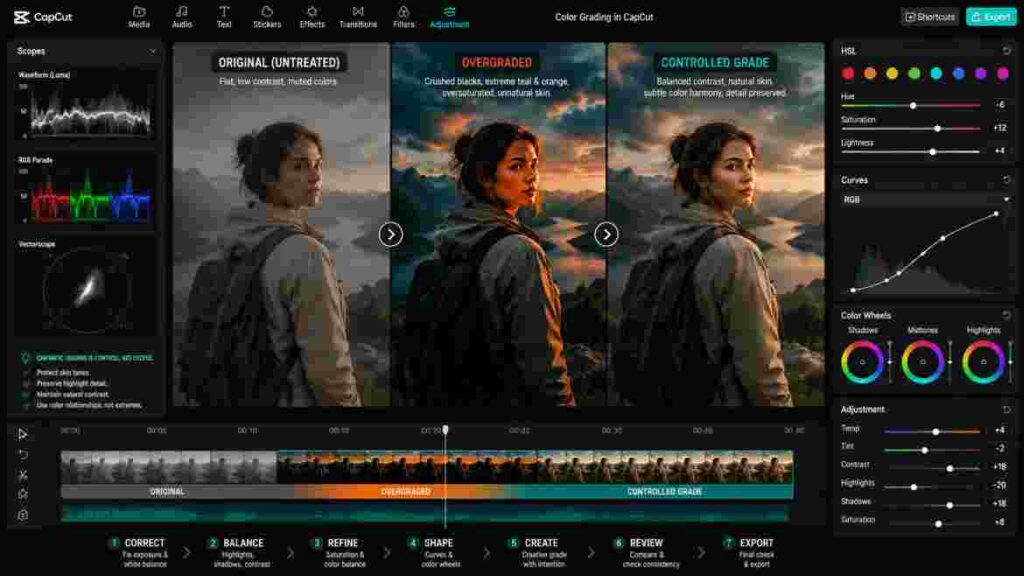
“Cinematic” is one of the most frequently used words in video-editing tutorials, yet it has no single color formula.
Cinema includes warm dramas, cold thrillers, highly saturated musicals, restrained documentaries, low-contrast period pieces, monochromatic sequences, and countless other styles.
When creators ask for cinematic color, they usually want footage that feels more controlled, cohesive, deliberate, and less like untreated camera output.
Begin With Correction
Cinematic styling does not remove the need for basic correction.
If one shot is too blue and another is too orange, applying the same creative look will not necessarily make them match.
Correct the technical foundation first.
Build Intentional Contrast
Contrast contributes strongly to perceived depth, but maximum contrast is not the goal.
Decide where the viewer should look and how much detail the scene needs.
An intimate lifestyle scene may benefit from softer contrast. A dramatic sequence may support deeper tonal separation.
Control Saturation
Sophisticated color often comes from controlling relationships rather than making every color vivid.
You might maintain healthy skin and a rich sky while reducing distracting vegetation or background colors.
Selective color creates hierarchy.
Preserve Natural Skin
Skin is a critical checkpoint for cinematic Color Grading in CapCut.
A stylized environment can still contain believable faces.
After every major creative change, look at the subject again.
If the background looks impressive but skin becomes orange, red, green, or gray, refine the grade.
Use Color Separation Carefully
Color separation can help create depth between subject and environment.
A relatively warm subject against a slightly cooler background is one possibility. A colorful subject against a restrained environment is another.
The broader principle matters more than any specific palette.
Don’t Confuse Dark With Cinematic
Making footage dark does not automatically make it cinematic.
If the subject becomes difficult to see and shadow detail disappears, the image may simply be underexposed-looking.
Dark scenes can remain visually rich when important information is controlled.
Don’t Copy Cinematic Settings Blindly
A creator may share exact contrast, saturation, temperature, and Curves settings that look excellent on their footage.
Those numbers describe their source, not yours.
Use examples to understand techniques, then adapt them to your own image.
LUTs and Color Grading in CapCut
LUTs can be useful, but they are often misunderstood.
A LUT transforms color according to predetermined mappings. Depending on its purpose, it may provide a technical transformation, creative style, or another defined treatment.
You can also explore CapCut’s color grading tools to see CapCut’s current guidance on HSL, Color Wheels, Curves, filters, and color adjustments across its editing platforms.
Why LUT Results Vary
A LUT can look beautiful in a preview and completely different on your clip because the input footage is different.
Exposure, white balance, camera processing, lighting, saturation, and source characteristics all influence the result.
This is why Color Grading in CapCut should not rely on the LUT name or preview alone.
Correct Before Applying a Creative LUT
For a beginner-friendly workflow, establish reasonable exposure and white balance before applying a creative LUT.
Then inspect what the LUT changes.
If contrast becomes too strong, refine it. If skin shifts, correct it. If saturation becomes excessive, control it.
The LUT should remain part of the workflow rather than replacing judgment.
When LUTs Save Time
LUTs can provide an efficient starting point when compatible footage needs a consistent creative direction.
They can also help you explore looks quickly.
Apply one, evaluate the direction, and decide whether it actually supports the footage.
When Manual Grading Is Better
Manual grading is particularly useful when the problem is selective.
If the background is too green while skin is correct, a global LUT may not solve the problem cleanly.
HSL may be more appropriate.
The strongest workflow can combine both approaches.
Filters vs. Color Grading in CapCut
Filters are designed primarily for convenience, while manual grading provides more control.
Neither is inherently superior.
A restrained filter can be completely appropriate for a short social video if the footage is already balanced.
When Filters Work Well
Filters can save time when you want a quick consistent style and do not need detailed correction.
This can be useful for Reels, TikToks, Shorts, or casual creator projects.
When Manual Adjustment Is Better
Manual Color Grading in CapCut becomes more valuable when individual problems need different solutions.
If one clip is too warm, another is too dark, and a third has excessive green saturation, a single filter cannot necessarily address all three appropriately.
Combining Filters With Manual Controls
Filters and manual adjustments can work together, but evaluate their combined effect.
If a filter already adds warmth and contrast, increasing both again manually may overprocess the image.
Every layer should contribute something useful.
Color Grading in CapCut on Mobile vs. Desktop vs. Web
CapCut exists across different environments, which is one reason tutorials can sometimes appear inconsistent.
The exact controls and their locations can change by platform and version. Focus on the purpose of the adjustment rather than expecting every screen to match an older tutorial exactly.
CapCut Mobile
Mobile is convenient for creators who capture and edit on the same device.
It is especially practical for short-form workflows where speed matters.
The main limitation is not necessarily the availability of basic color controls but the physical size of the display. Subtle tonal and color differences can be harder to judge on a small screen.
Screen brightness can also influence perception.
CapCut Desktop
Desktop offers more space for evaluating footage and comparing clips.
That can make detailed Color Grading in CapCut more comfortable, particularly when you have longer timelines, many clips, selective adjustments, or extensive shot matching.
A larger preview also makes it easier to inspect skin, highlight detail, and subtle background colors.
CapCut Web
Browser-based editing can provide convenient access without relying entirely on a locally installed application.
However, do not assume every advanced feature is identical across environments.
If a particular color tool is essential to your project, confirm its availability in the version you are currently using.
Which Platform Is Better?
The best platform depends on the project.
Mobile emphasizes convenience. Desktop generally provides a more comfortable environment for detailed comparison. Web can offer accessible browser-based workflows.
The fundamental color principles remain the same.
How to Match Multiple Clips During Color Grading in CapCut
Shot matching is one of the clearest differences between grading a photograph and grading a video.
A video exists over time.
One beautiful frame does not create a beautiful sequence if the next shot suddenly changes color.

Match Exposure First
Begin with overall brightness.
Large exposure differences are usually easier to notice than subtle hue differences.
Bring neighboring shots into a reasonably similar tonal range where the scene requires continuity.
Match White Balance
Compare temperature and tint.
If the same person’s face appears warm in one angle and cool in another, the mismatch becomes obvious.
Repeated objects can also help. A wall, shirt, table, or other item visible in both shots should not change dramatically unless the lighting genuinely changes.
Match Contrast
Two clips can have similar brightness but very different contrast.
One may contain deep shadows while another looks flat.
Correct those relationships before focusing on tiny color differences.
Match Saturation
Different cameras often produce different levels of color intensity.
Bring the overall saturation into reasonable agreement.
Refine Individual Colors
Once broad characteristics match, HSL can address remaining differences.
Perhaps one camera renders greens differently or produces stronger blues.
Selective refinement can help without disturbing the entire image.
Judge the Transition
The best way to evaluate matching during Color Grading in CapCut is to watch the actual cut.
Play Clip A, Clip B, and then Clip A again if necessary.
If the color change attracts your attention more than the content, continue refining.
How to Keep Skin Tones Natural During Color Grading in CapCut
Skin is one of the most sensitive areas of video color because viewers are familiar with how people should look.
Even a technically interesting grade can feel wrong when faces become unnatural.
Correct White Balance First
If every face appears too warm or too green, investigate the overall white balance before making selective skin adjustments.
Fix the cause before treating the symptom.
Control Global Saturation
Increasing saturation to strengthen a background can simultaneously make skin red or orange.
If that happens, reduce the global adjustment and consider enhancing the relevant environmental colors selectively.
Be Careful With Warmth
Warm grades can be attractive, but skin already contains naturally warm color.
A small global increase may therefore affect faces more noticeably than expected.
Respect Natural Differences
People have different complexions and undertones.
Do not force every subject into the same “perfect skin” recipe.
Believable skin depends on the actual person, lighting, environment, and creative intention.
Recheck Faces Repeatedly
During Color Grading in CapCut, make a habit of checking faces after significant changes.
Adjust the environment, then look at the subject.
Apply a LUT, then look at the subject.
Change the Color Wheels, then look at the subject.
This simple routine prevents many common mistakes.
Color Grading in CapCut for Different Types of Videos
The purpose of the video should influence the grade.
A single preset should not be expected to serve every genre equally well.
Talking-Head Videos
Talking-head content usually benefits from clean exposure, believable skin, and consistent color.
The viewer’s attention should remain on the speaker.
If the background is distracting, subtle selective correction may help without making the person appear heavily processed.
YouTube Tutorials
Tutorials prioritize clarity.
Objects, interfaces, products, and demonstrations need to remain readable.
Avoid grades that hide important detail simply because they create stronger atmosphere.
For educational content, good Color Grading in CapCut often means polished color that does not call attention to itself.
Travel Videos
Travel footage provides greater creative freedom.
You may want to emphasize sunset warmth, ocean blues, architecture, vegetation, or nighttime city lighting.
However, preserve the identity of each location.
A tropical beach and a rainy British street do not need the same palette.
Product Videos
Product color can directly affect viewer expectations.
A blue shirt should not become purple simply because the grade looks stylish. Cosmetic shades, furniture, food packaging, paint, clothing, and other color-sensitive products require particular care.
Prioritize accuracy before creative styling.
Food Videos
Food can benefit from controlled warmth and saturation, but too much processing can make ingredients appear artificial.
Selective treatment of reds, greens, yellows, and oranges may work better than globally increasing color intensity.
Night Footage
Night footage requires restraint.
Lifting shadows aggressively can reveal noise, while lowering them too far can hide important information.
Good Color Grading in CapCut for night scenes preserves darkness while maintaining enough subject visibility.
TikTok, Instagram Reels, and Shorts
Short-form content needs immediate visual clarity on small screens.
Strong color can work, but strong does not mean uncontrolled.
Prioritize subject visibility, skin, text readability, and consistency.
Vlogs
Vlogs often move through many lighting environments.
Instead of forcing every scene to look identical, aim for consistency within each environment and a coherent creative direction across the full video.
Common Color Grading in CapCut Mistakes
Many beginner mistakes come from making adjustments too aggressively rather than lacking enough tools.
Understanding what to avoid can improve your results quickly.
Grading Before Correcting
Creative treatments can exaggerate technical problems.
Correct major exposure and white-balance issues before developing the final look.
Oversaturating Everything
Vivid colors can initially appear impressive.
After longer viewing, excessive saturation often looks artificial.
If only one color needs improvement, use a selective tool rather than increasing everything.
Crushing the Shadows
Deep shadows can add depth, but eliminating useful information does not automatically make footage cinematic.
Protect important detail.
Flattening the Image With Shadow Recovery
The opposite mistake occurs when creators lift shadows until every dark region becomes visible.
This can remove depth and expose noise.
Not every shadow needs recovery.
Destroying Highlights
Aggressive contrast or Curves can make bright areas harsh.
Check faces, clouds, windows, white clothing, and reflective objects.
Making Skin Orange
Excessive temperature, saturation, HSL, LUTs, filters, or Color Wheels can all contribute.
Check the face repeatedly.
Overusing Teal and Orange
Teal-and-orange grading can be effective, but it is not a requirement for cinematic Color Grading in CapCut.
Use it because it suits the scene, not because it is recognizable.
Using the Same Numerical Settings on Every Clip
Identical values do not guarantee identical appearance.
Two shots can start from completely different conditions.
Match visual results rather than numbers.
Stacking Too Many Adjustments
A LUT, filter, strong Curves, aggressive HSL, and high saturation can create a grade where several tools fight one another.
Simplify whenever possible.
Ignoring Shot Consistency
A perfectly graded hero shot does not compensate for mismatched neighboring footage.
The viewer experiences the complete sequence.
Never Comparing With the Original
Your eyes adapt.
Regular before-and-after comparison helps reveal whether the grade has become excessive.
Troubleshooting Color Grading in CapCut
When something looks wrong, diagnose the symptom before adding another adjustment.
Random correction often creates more complexity.
Why Does My Video Look Too Orange?
Check temperature first.
Then examine global saturation, filters, LUTs, HSL, and Color Wheels.
Temporarily disable major creative adjustments individually.
If the unwanted orange disappears when one adjustment is removed, you have identified a likely cause.
Why Does My Video Look Too Blue?
Determine whether the source had a cool white balance or whether the creative grade introduced excessive blue.
Correct the technical cause rather than compensating with unrelated settings.
Why Does Skin Look Red?
Red skin can come from white balance, saturation, lighting, HSL, filters, or LUTs.
Reduce suspected adjustments temporarily and compare.
Avoid desaturating the entire video unless the entire image is actually oversaturated.
Why Does the Video Look Washed Out?
A washed-out result may come from excessive shadow lifting, insufficient contrast, lifted blacks, strong highlight recovery, or a particular filter.
Compare with the source and disable adjustments one at a time.
Why Is the Video Too Dark?
Determine whether the entire image is too dark or only the shadows.
This distinction determines whether overall exposure or a targeted tonal adjustment is more appropriate.
Why Are the Shadows Noisy?
The original footage may have been underexposed.
Raising shadows during Color Grading in CapCut can reveal noise already present in the recording.
Sometimes accepting slightly darker shadows produces a cleaner result.
Why Do Highlights Look Harsh?
Inspect exposure, highlights, contrast, and Curves.
If the source is clipped, complete detail recovery may not be possible.
Aim for the most natural transition the available information allows.
Why Don’t Multiple Clips Match?
Return to fundamentals.
Compare exposure first, then white balance, contrast, saturation, and selective colors.
Do not try to solve a major technical mismatch with another creative filter.
Why Does My LUT Look Different From the Preview?
Your footage probably has different input characteristics from the demonstration footage.
Exposure, white balance, lighting, camera processing, and existing saturation can all affect the transformation.
Why Does the Export Look Different?
The difference may come from the display, brightness, playback environment, compression, or platform processing.
Compare under consistent conditions before assuming the grade itself is incorrect.
How to Handle Difficult Footage During Color Grading in CapCut
Not every clip begins from an ideal source.
Some footage contains multiple technical problems, and those clips require especially careful correction.
Underexposed Footage
If footage is dark, determine what genuinely needs to become visible.
Increase exposure or relevant tonal regions gradually.
Watch for noise.
If aggressive recovery makes the image noisy and muddy, a slightly darker but cleaner result may be preferable.
Overexposed Footage
Reduce exposure or highlights and look for actual recoverable detail.
If an area was completely clipped during capture, do not spend excessive time trying to restore information that may not exist.
Work around the limitation and create the most balanced result possible.
Mixed Lighting
Mixed lighting occurs when different light sources have different color characteristics.
For example, daylight may illuminate one side of a face while warm indoor light illuminates the other.
A global temperature adjustment can fix one side while making the other worse.
This is inherently more difficult than correcting a uniform cast.
For Color Grading in CapCut, aim for the most believable compromise available rather than expecting one global slider to perfectly neutralize every region.
Highly Saturated Source Footage
If the camera already produces vivid color, increasing saturation further can quickly become artificial.
Consider reducing global intensity first and selectively rebuilding the colors that matter.
Flat Footage
Flat footage may need stronger tonal structure.
Start with exposure and contrast relationships before adding saturation.
Once contrast improves, colors may already appear richer without requiring a large saturation increase.
Professional Color Grading in CapCut Workflow
Once the individual tools become familiar, a repeatable process helps you work faster and make more consistent decisions.
The workflow can be understood through eight stages.
Inspect
Watch the footage and identify problems before making adjustments.
Look for exposure, white balance, saturation, contrast, and consistency issues.
Correct
Fix the largest technical problems first.
Create a believable baseline.
Balance
Refine highlights, shadows, contrast, and global saturation.
At this stage, the footage should look reasonably clean without needing a strong creative treatment.
Match
Compare clips belonging to the same scene.
Bring exposure, white balance, contrast, and saturation into reasonable agreement.
Grade
Develop the visual character.
Use HSL, Curves, Color Wheels, LUTs, filters, and other appropriate controls.
Refine
Inspect skin, skies, vegetation, products, clothing, highlights, and shadows.
Correct unintended side effects.
Review
Watch the complete sequence rather than isolated frames.
Look for abrupt changes and signs of overprocessing.
Export
Render the final video and inspect the actual output.
The complete Color Grading in CapCut workflow can therefore be summarized as:
Inspect → Correct → Balance → Match → Grade → Refine → Review → Export
This process is far more useful than memorizing somebody else’s settings.
Best Practices for Color Grading in CapCut
Once the technical process becomes familiar, several habits can improve consistency and prevent overediting.
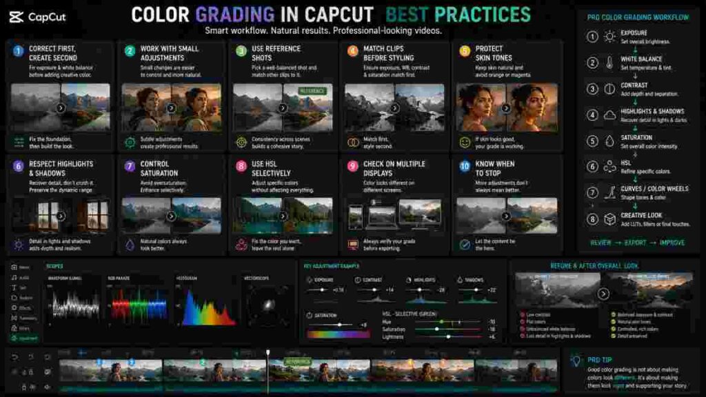
Start With Small Adjustments
Large changes are easy to make and difficult to judge after your eyes adapt.
Begin conservatively.
If the footage genuinely needs more, increase the adjustment gradually.
Judge the Entire Frame
Whenever you adjust one color, inspect every object that may share that color.
Whenever you change contrast, inspect both shadows and highlights.
Whenever you warm the environment, inspect skin.
Every adjustment has consequences.
Compare Before and After
Before-and-after comparison keeps your perception calibrated.
You may discover that a grade you considered subtle is actually much stronger than expected.
Match Before Heavy Stylization
Bring related clips into reasonable technical agreement before applying a strong creative look.
This gives Color Grading in CapCut a stable foundation and makes consistency easier to maintain.
Let the Content Determine the Look
A corporate interview, food video, travel montage, beauty tutorial, nighttime vlog, and product demonstration have different visual priorities.
Do not force the same grade onto every project.
Preserve Important Detail
Creative style should not automatically come at the expense of visibility.
Protect important facial detail, products, text, clothing, and environmental information where appropriate.
Know When to Stop
This is one of the most valuable grading skills.
More adjustments do not automatically create a better result.
If another change does not solve a problem or strengthen the intended mood, it may be unnecessary.
Is Color Grading in CapCut Good Enough for Professional Results?
The answer depends on what “professional” means for the project.
CapCut can provide useful correction and creative grading capabilities for YouTube, social media, creator videos, promotional content, personal projects, and many other everyday workflows.
A professional result is not determined solely by the name of the software.
A creator who understands exposure, white balance, tonal relationships, shot matching, selective color, and restraint can produce stronger results with accessible tools than someone using advanced software without understanding the fundamentals.
However, dedicated professional color-grading applications can provide deeper color-management systems, scopes, monitoring workflows, advanced secondary corrections, collaboration capabilities, and other features required in demanding production environments.
That does not make Color Grading in CapCut ineffective.
It means tools should be matched to the project.
For creator-focused work where speed, accessibility, editing, and grading need to remain in one environment, CapCut can be practical. If your workflow eventually requires specialist post-production control, the fundamentals learned here remain valuable because exposure, white balance, contrast, shot matching, and color relationships transfer to more advanced systems.
Do You Need the Best Color Grading in CapCut Settings?
The desire for fixed settings is understandable.
Numbers are easy to copy. Visual judgment takes practice.
A tutorial can tell you to set contrast to one value, saturation to another, and temperature to a third. You can reproduce those numbers immediately.
The problem is that those settings describe how the adjustments interact with that creator’s footage.
Your footage may begin from a completely different place.
Suppose two clips receive the same warm temperature adjustment. One started too cool, so the result becomes balanced. The other was already warm, so the same adjustment makes it orange.
That is why the “best settings” are the settings the specific shot needs.
For effective Color Grading in CapCut, replace the question “What number should I use?” with “What problem am I trying to solve?”
If the footage is too cool, warm it appropriately.
If the whole image is too dark, correct overall exposure.
If only the shadows are dark, work more selectively.
If the sky needs stronger color but skin already looks correct, use a selective adjustment.
This approach requires more judgment initially, but it develops skills that work across different projects.
Advanced Decision-Making for Color Grading in CapCut
Once you understand individual controls, the next level is deciding which tool should solve which problem.
This is where many creators become more efficient.
Global vs. Selective Adjustments
Always ask whether the problem affects the whole image.
If the entire clip is too warm, temperature may be appropriate.
If only one object is too warm, a global temperature change could damage everything else.
Similarly, if every color looks muted, global saturation may help. If only green vegetation is excessive, HSL is likely more appropriate.
Choosing between global and selective correction is a central skill in Color Grading in CapCut.
Correction vs. Creative Intention
Another important decision is determining whether a characteristic is actually a problem.
A warm sunset is not incorrectly white-balanced simply because whites are not neutral.
Blue nighttime light may be intentional.
Colored concert lighting should not necessarily be removed.
Correction should preserve the character of the scene.
Technical Consistency vs. Natural Variation
Matching clips does not mean making every shot mathematically identical.
Lighting can naturally change as a person moves through a location.
A camera facing a window may produce different tonal relationships from a reverse angle facing an interior.
The goal is to remove distracting inconsistency without eliminating believable environmental variation.
Accuracy vs. Style
Some projects prioritize accuracy.
Product videos, tutorials, demonstrations, and certain branded content may require colors to remain relatively faithful.
Other projects allow greater creative interpretation.
Understand that requirement before developing the grade.
How to Make Color Grading in CapCut Look Natural
Natural grading is often harder than dramatic grading because subtle mistakes become more noticeable.
The goal is not to remove every trace of creative treatment. It is to make the result believable.
Respect the Original Lighting
If the scene was filmed during golden hour, preserve some warmth.
If it was recorded on an overcast day, do not necessarily force it into bright sunny color.
The source lighting provides useful creative information.
Protect Neutral Relationships
Objects that viewers expect to look neutral can help reveal unwanted casts.
But context still matters. A white wall illuminated by warm light may naturally appear warm.
Use multiple visual references rather than relying on one object.
Avoid Extreme HSL Shifts
Natural environments contain complex color variation.
Turning all greens into the same stylized hue can make foliage look artificial.
Small refinements preserve texture and realism.
Maintain Believable Skin
Skin is one of the strongest indicators of whether Color Grading in CapCut still feels natural.
If the environment looks beautiful but faces appear processed, reduce or refine the treatment.
How to Make Color Grading in CapCut More Consistent Across a Long Video
Long-form content introduces a different challenge: consistency over time.
A 30-second Reel may contain only a handful of clips. A 20-minute YouTube video can contain dozens or hundreds.
Work Scene by Scene
Do not try to make every clip in the entire project identical.
Group footage according to lighting and location.
Establish a reference within each scene.
This makes the workload more manageable.
Correct Major Differences First
Do not spend time refining subtle HSL differences while one clip is obviously two stops darker-looking than another.
Work from large problems toward small ones.
Review at Normal Playback Speed
Repeatedly stopping on individual frames can make you lose sight of the viewing experience.
Watch longer sections at normal speed.
If no color change distracts you, the matching may already be sufficient.
Revisit Earlier Scenes
As your eyes adapt to the grade, later sections may drift away from the look established at the beginning.
Return to earlier reference shots periodically.
This keeps Color Grading in CapCut visually coherent across a longer timeline.
Color Grading in CapCut for Social Media
Social platforms introduce practical considerations because viewers use many different devices and often watch under uncontrolled conditions.
A grade that only looks good on one carefully adjusted monitor may not translate well.
Prioritize Clarity
Small screens make subtle details harder to see.
Ensure the subject remains readable and important text is not compromised by dark backgrounds or excessive contrast.
Avoid Depending on Extremely Dark Shadows
Viewers may watch outdoors or with reduced screen brightness.
If crucial information exists only in very dark regions, it may disappear in real-world viewing.
Keep Skin Controlled
Faces are often the visual center of short-form content.
Strong saturation and warmth can become particularly noticeable on close-up smartphone viewing.
Review the Final Upload When Possible
Platforms can recompress video.
After publishing, inspect the actual result to make sure the visual treatment still works as intended.
Color Grading in CapCut for YouTube
YouTube content often combines multiple visual sources, including talking-head footage, B-roll, screen recordings, product shots, and footage from different cameras.
Consistency therefore becomes especially important.
Match Camera Angles
If a talking-head video uses two cameras, match skin, exposure, white balance, and contrast before applying a creative style.
A visible shift every time the angle changes can make an otherwise professional setup feel inconsistent.
Keep Educational Content Readable
When the video teaches something, color should support comprehension.
Do not hide objects or demonstrations inside dramatic shadows simply to create atmosphere.
Use B-Roll Creatively but Coherently
B-roll can support a stronger creative grade than the main talking-head footage, but it should still feel like part of the same production.
Look for shared tonal or color characteristics that connect the material.
Color Grading in CapCut for Travel Videos
Travel videos are ideal for creative color because locations naturally provide strong visual identities.
The challenge is enhancing those identities without turning every destination into the same preset.
Preserve the Time of Day
Morning, midday, golden hour, blue hour, and nighttime each have distinct color characteristics.
Use grading to strengthen those differences rather than erase them.
Control Greens and Blues
Travel footage often contains vegetation, skies, and water.
These colors can easily become oversaturated.
Use selective adjustments when necessary.
Protect People Within Landscapes
A dramatic landscape grade can make faces unnatural.
If people appear prominently, check skin after environmental adjustments.
Match Sequences, Not Entire Trips
A beach sequence may appropriately feel different from a nighttime city sequence.
Consistency should exist within each visual chapter while the overall project maintains a coherent style.
This approach makes Color Grading in CapCut more expressive without sacrificing continuity.
Color Grading in CapCut for Product and Commercial Videos
Commercial-looking color often depends more on control and accuracy than dramatic styling.
Preserve Product Color
If the viewer may make a purchase based on the video, avoid changing the product’s color substantially.
This is especially important for clothing, cosmetics, furniture, paint, food, and decorative products.
Separate the Product From the Background
Instead of simply increasing product saturation, consider whether the background can be made less visually dominant.
Tonal or selective color separation can create a cleaner result.
Keep Whites Clean When Appropriate
Product photography and video often use white or neutral backgrounds.
Unwanted yellow, blue, green, or magenta casts can make the setup appear less polished.
Correct white balance carefully.
Use Creative Color Around the Product
The environment can still have a distinctive mood as long as the product remains appropriately represented.
This balance between accuracy and style is an important commercial application of Color Grading in CapCut.
Color Grading in CapCut for Food Videos
Food has its own visual challenges because viewers have strong expectations about what ingredients should look like.
Warmth Can Help, but Don’t Overdo It
A small amount of warmth may make some dishes feel inviting.
Too much can make white plates yellow and fresh ingredients unnatural.
Watch Reds and Oranges
Meat, sauces, tomatoes, baked goods, and spices can become excessively intense when saturation is pushed globally.
Selective control is often safer.
Keep Greens Fresh
Vegetables and herbs should not become fluorescent.
If they already appear vivid, avoid unnecessary saturation.
Preserve Texture
Food relies on visible texture.
Overly dark shadows or harsh highlights can hide details that make the dish appealing.
Color Grading in CapCut for Night and Low-Light Video
Night footage presents a tradeoff between visibility, atmosphere, and noise.
Do Not Brighten Night Into Day
Darkness is part of the scene.
Raise exposure only enough to make important subjects readable.
Be Careful With Shadow Recovery
Underexposed footage often contains visible noise in dark areas.
Raising shadows can make that noise much more obvious.
Control Artificial Lighting
Streetlights, signs, screens, and decorative lighting can create strong colors.
Decide which colors contribute to the atmosphere and which become distracting.
Preserve Highlight Character
Bright practical lights may naturally be much brighter than their surroundings.
Do not flatten the scene by trying to make every light source contain equal detail.
Controlled Color Grading in CapCut preserves the contrast that makes night footage feel like night.
How to Avoid Overediting During Color Grading in CapCut
Overediting often happens gradually.
Each individual adjustment seems small, but their combined effect becomes extreme.

Toggle Adjustments Off Periodically
Temporarily disable major creative changes.
If the original suddenly looks dramatically more natural, evaluate whether the grade needs to be reduced.
Watch the Video Away From the Editing Mindset
After making detailed adjustments, play the sequence without touching any controls.
Watch it as a viewer.
Does anything distract you?
If you immediately notice the color treatment rather than the content, decide whether that is intentional.
Simplify Competing Adjustments
If one control adds warmth and another removes it, ask why both exist.
If a LUT adds strong contrast and your Curves add even more, determine whether both are necessary.
A simpler grade is easier to understand and maintain.
A Practical Color Grading in CapCut Example
Imagine a travel clip showing a person walking beside a lake during late afternoon.
The original footage is slightly dark. The person’s face looks a little cool, the sky is bright, and the vegetation is highly saturated.
A weak workflow might begin with a cinematic LUT. The LUT increases contrast, makes the face even darker, and pushes the greens further. You then begin compensating for those changes.
A stronger workflow begins with diagnosis.
First, increase overall exposure only enough to make the subject comfortable to see. Next, correct the slightly cool white balance while preserving the natural late-afternoon character. Reduce highlights modestly if the sky contains recoverable detail. Evaluate the shadows and contrast without flattening the scene.
At this point, inspect saturation. Because the vegetation is already strong, avoid increasing global saturation. Instead, use HSL to control the greens selectively.
Now the footage has a clean foundation.
Only then develop the creative look. You might introduce a gentle warm character, shape contrast slightly with Curves, and create subtle tonal separation.
Finally, check the person’s face again.
That sequence demonstrates the central logic of Color Grading in CapCut: solve the source problems before creating the style.
Another Color Grading in CapCut Example: Talking-Head Video
Consider a creator recording indoors beside a window.
The face is reasonably exposed, but the indoor lighting creates a slight green cast. The background is brighter than desired, and a colorful object behind the presenter competes for attention.
Start with white balance. Instead of warming the image randomly, identify the green cast and correct it appropriately.
Next, evaluate the tonal balance. Because the face is already acceptable, avoid making a large global exposure change simply to control the background.
Refine highlights or other available tonal controls as needed.
Then address the distracting object. Rather than desaturating the entire video, use selective color control if practical.
The result remains natural, but the viewer’s attention is better directed toward the speaker.
This is often what professional-looking color actually means: not dramatic transformation, but deliberate visual control.
How Color Grading in CapCut Works With Other Editing Decisions
Color does not exist separately from the rest of the edit.
Transitions, overlays, text, effects, and pacing can all influence how the grade is perceived.
Transitions
A smooth transition between clips can still feel awkward if the two shots have dramatically different exposure or white balance.
Match color before relying on a transition to hide the cut.
Color consistency also matters when creating transitions in CapCut, because even a smooth transition can feel distracting when the connected clips have noticeably different exposure, white balance, or saturation.
Text and Captions
Text must remain readable against the graded background.
If your creative treatment darkens or brightens the footage significantly, check caption contrast throughout the sequence.
Effects
Visual effects may introduce their own color or contrast.
Evaluate the final combined image rather than grading the raw clip and assuming the effect will not change perception.
Visual effects can introduce their own color, contrast, glow, or stylistic treatment, so understanding how to use CapCut effects effectively can help you prevent effects and color adjustments from competing with each other.
Overlays
Image and video overlays can have different color characteristics from the main footage.
If they are meant to appear integrated, consider whether their exposure, temperature, or saturation needs refinement.
This broader perspective helps Color Grading in CapCut support the complete edit rather than operating as an isolated final step.
Final Color Grading in CapCut Quality-Control Checklist
Before exporting, review the project systematically. This is one of the few places where a compact checklist is more useful than long explanatory paragraphs.
Check that:
- The main subject is comfortably visible.
- White balance looks intentional.
- Skin tones remain believable.
- Important highlights retain appropriate detail.
- Important shadows are readable without becoming unnaturally lifted.
- Contrast suits the mood.
- Saturation does not make skin, vegetation, skies, food, or products artificial.
- Selective HSL changes do not create strange colors elsewhere.
- LUTs and filters are not overpowering the footage.
- Related clips match in exposure, white balance, contrast, and saturation.
- Creative color remains consistent within each scene.
- Important product colors remain accurate where required.
- The grade still works during normal playback.
- The result has been compared with the original.
- The exported file has been inspected before publication.
If several of these checks fail, do not automatically add another adjustment. Identify the underlying problem first.
Conclusion
Learning Color Grading in CapCut is not about discovering a secret cinematic preset or memorizing a list of numbers. It is about understanding how brightness, white balance, contrast, saturation, selective color, and tonal relationships work together.
Start by inspecting the footage. Determine what actually needs correction rather than moving sliders randomly. Correct overall exposure and unwanted color casts, balance highlights and shadows, establish appropriate contrast, and control global saturation. When several clips belong to the same scene, match them before building a strong creative look.
Once the technical foundation is stable, use HSL, Curves, Color Wheels, LUTs, filters, and other available tools to create the intended visual character. Keep those decisions connected to the subject and story rather than using them simply because they are available.
Successful Color Grading in CapCut also requires restraint. Skin should remain believable. Products should retain appropriate color when accuracy matters. Highlights and shadows should preserve useful information where the source allows it. Landscapes should not become artificial simply because HSL makes extreme color changes possible.
Most importantly, stop searching for one universal combination of settings.
A talking-head video, travel montage, nighttime street sequence, food video, product demonstration, and TikTok do not begin from the same source or serve the same purpose. Their color decisions should reflect those differences.
The more you learn to diagnose the image, the less dependent you become on presets.
That is the real skill behind Color Grading in CapCut.
Remember the principle that should guide the entire workflow:
Correct the footage first. Create the look second.
When correction, consistency, and creative intention work together, Color Grading in CapCut stops being a collection of sliders and becomes a practical part of visual storytelling.